For many of us, the first thing we visualize when it comes to whisky is the design of our favorite bottle. Bottles that sit on modern bar shelves must capture the attention of drinkers with an increasingly dizzying array of options. Higher end whiskies of course must also look like higher end whiskies. As a result, many companies put in a ton of effort into their bottle designs. During this process, designs are constantly created, thrown away, redeveloped, and honed.
Just because some concepts don’t end up as a final product doesn’t mean they are completely lost. Reader David Storey pointed out some intriguing Suntory whisky bottle concepts that won Pentawards packaging design awards over the past couple years.
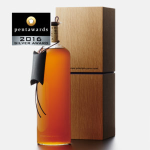
In 2016 Suntory won a Silver Pentaward in the Luxury category for this concept. Looks like it belongs to a bottle of Yamazaki. It was designed by Shizuko Ushijima, who also designed the Hibiki 30 packaging.
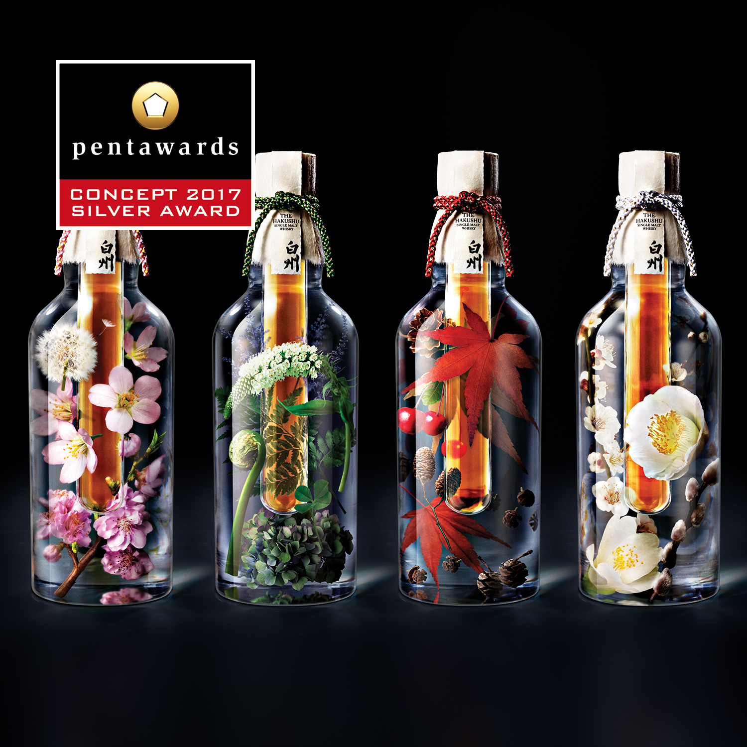
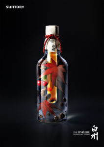
The following year, they won a Silver award for the “Hakushu Elements” concept. It was designed by Suntory’s famed in-house designer Akiko Furusho, responsible for designs like the Yamazaki Limited Edition series and more recently, Hibiki Blender’s Choice. Hakushu Elements is of course just a concept, and I don’t know how many people would want just a test tube of whisky. But it certainly looks cool!
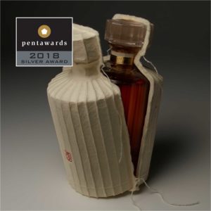
Finally, for 2018, Furusho-san also won Suntory a Silver award for this Hibiki packaging concept: a form-fitting package meant to be broken open, rather than a standard carton.
Thanks for the tip, David!
Hi there! I created and run nomunication.jp. I’ve lived in Tokyo since 2008, and I am a certified Shochu Kikisake-shi/Shochu Sommelier (焼酎唎酒師), Cocktail Professor (カクテル検定1級), and I hold Whisky Kentei Levels 3 and JW (ウイスキー検定3級・JW級). I also sit on the Executive Committees for the Tokyo Whisky & Spirits Competition and Japanese Whisky Day. Click here for more details about me and this site. Kampai!


